Filtering Pane: Filter options are wordy, unclear in their purpose, and don't subset the 5000+ datasets sufficiently
KPMP Repository: As part of the web app, the repository is used to download data from kidney disease biopsies. Filters on the left provide filters for users to narrow the search for a certain dataset. Datasets are listed in the center of the screen.
Names redacted for privacy
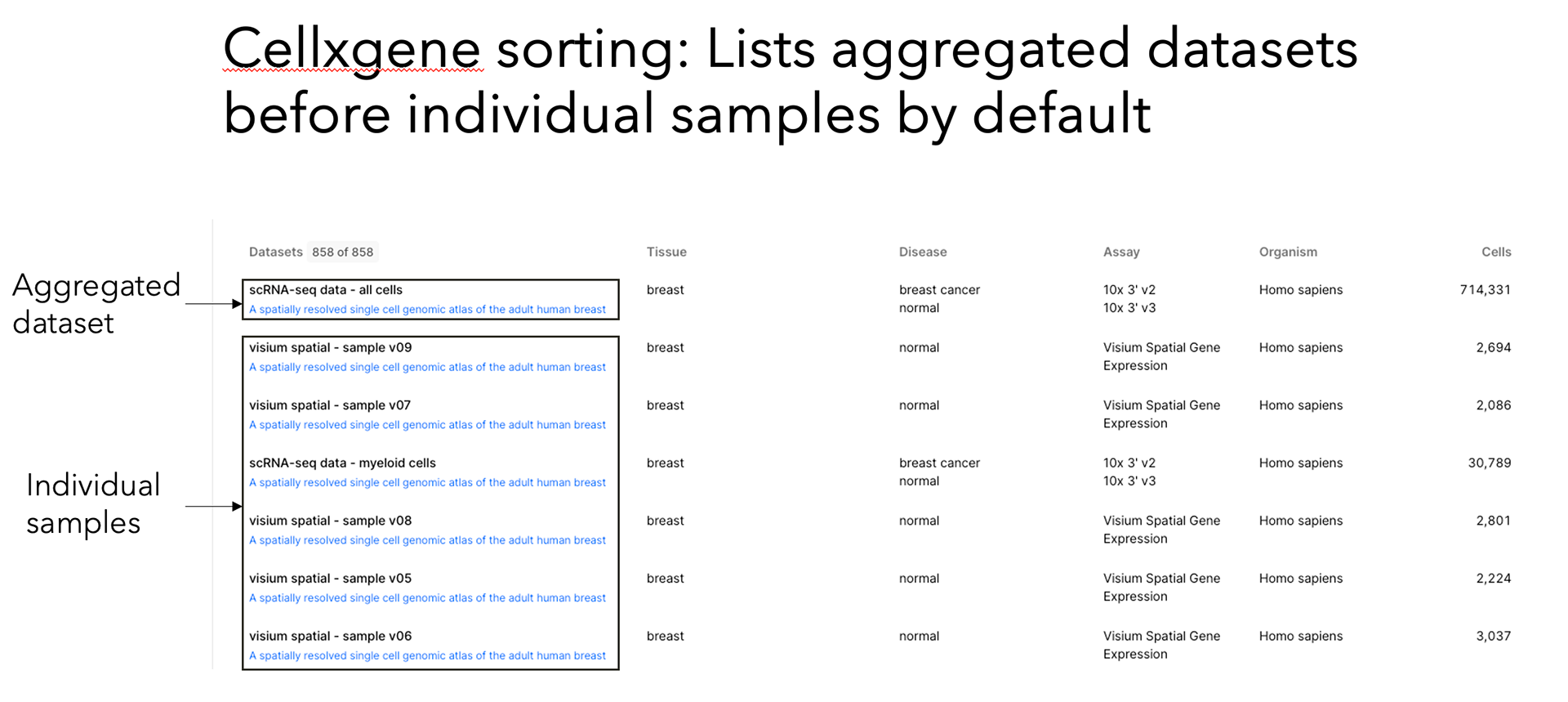
Cellxgene
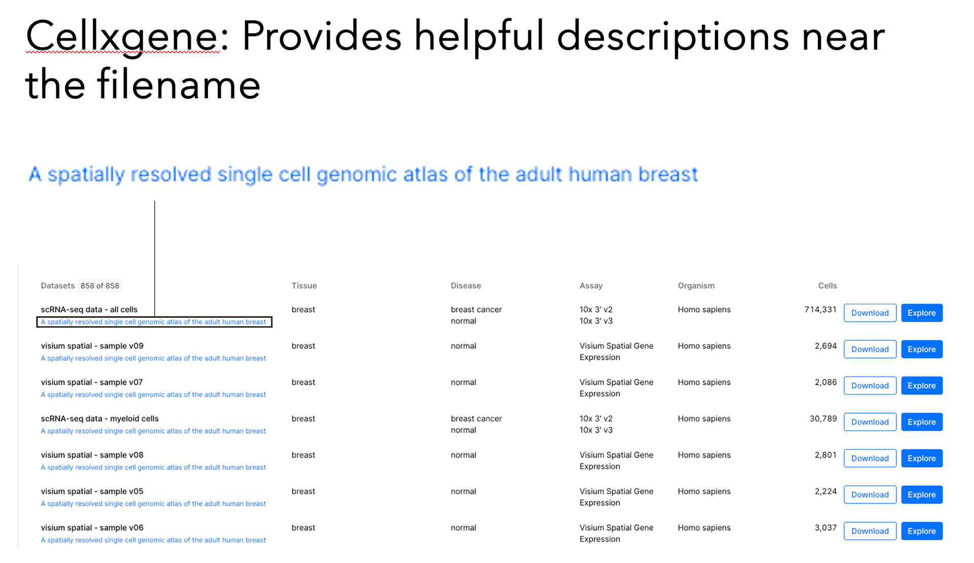
Cellxgene
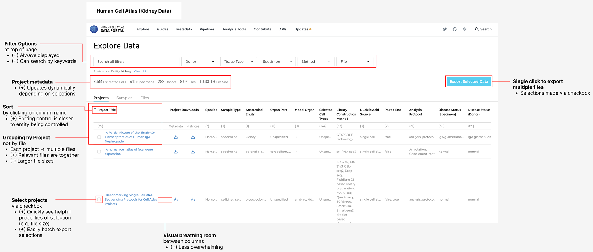
Human Cell Atlas
Current design overwhelms users: There's too many filter options and no explanation of what each of them mean.
My design: Breaks up the list with chunks, which makes it quickly scannable. A description is added for filter options that cause confusion.
Current design confuses users: There's too much granularity, leaving users wondering about the difference between filter options.
My design: Abstracts away granularity that's not useful to most users with nested filter groups.

