Role: Team Lead
Our award-winning desktop interface for the Federal Aviation Administration's (FAA) nationwide Design Challenge unifies 20+ interfaces and simplifies workflows for Air Traffic Managers
Highlights
• Architected the interface's 3 core user flows (Evaluating, Modeling, and Monitoring), which formed our product's unified user experience according to FAA judges
• Designed flagship "Data Card" visualization, which was highly praised by judges for summarizing "vital metrics for traffic managers in a clean way"
• Organized and led 20+ hours of user interviews and user tests with NASA, Delta Air Lines, Federal Aviation Administration (FAA), and Port Authority of New York
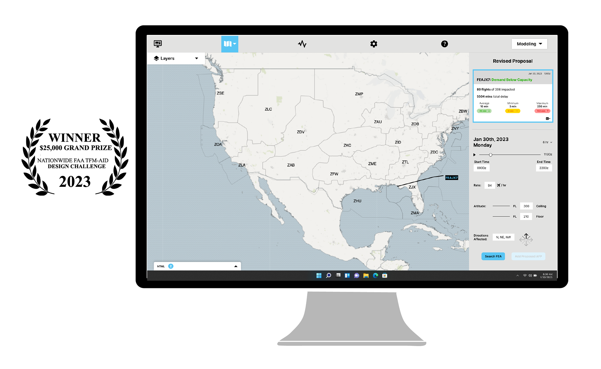
• Won $25,000 grand prize 🏆 and award for best speaker (Watch presentation of product concept to FAA and industry subject matter experts that took place in Washington, D.C.)
Overview
The FAA TFM-AID Design Challenge is a nationwide competition for college students to design a graphical user interface (GUI) for traffic managers to implement Airspace Flow Programs (AFP). AFPs are used to control commercial air traffic when there are airspace constraints, such as bad weather or rocket launches.
Through the Design Challenge, the Federal Aviation Administration (FAA) sought designs for a new interface that will streamline workflows for Traffic Managers and minimize user training. The new interface is part of a significant infrastructure upgrade called Flow Management and Data Services (FMDS). Our design concept will influence how air traffic is managed across the U.S. for decades.
I led the 8-month project, spanning November 2022 to June 2023. Our product was selected as one of five nationwide finalists in the Preliminary Design Review (PDR) stage, moved to the Critical Design Review (CDR) stage, and won 1st place at the FAA Design Challenge Forum in Washington, D.C.
Quick Links
➝ Press Release (coming soon)
Pitch to FAA Experts in 12 Minutes
Current Interface
For an FAA Traffic Manager (NTMS) to accomplish their tasks, they must navigate through 57 separate applications, each with their own unique interface. This results in inconsistent user experiences, repeated data entries, and confusion. Below are screenshots of the disparate user interfaces that must be used together on a regular basis:
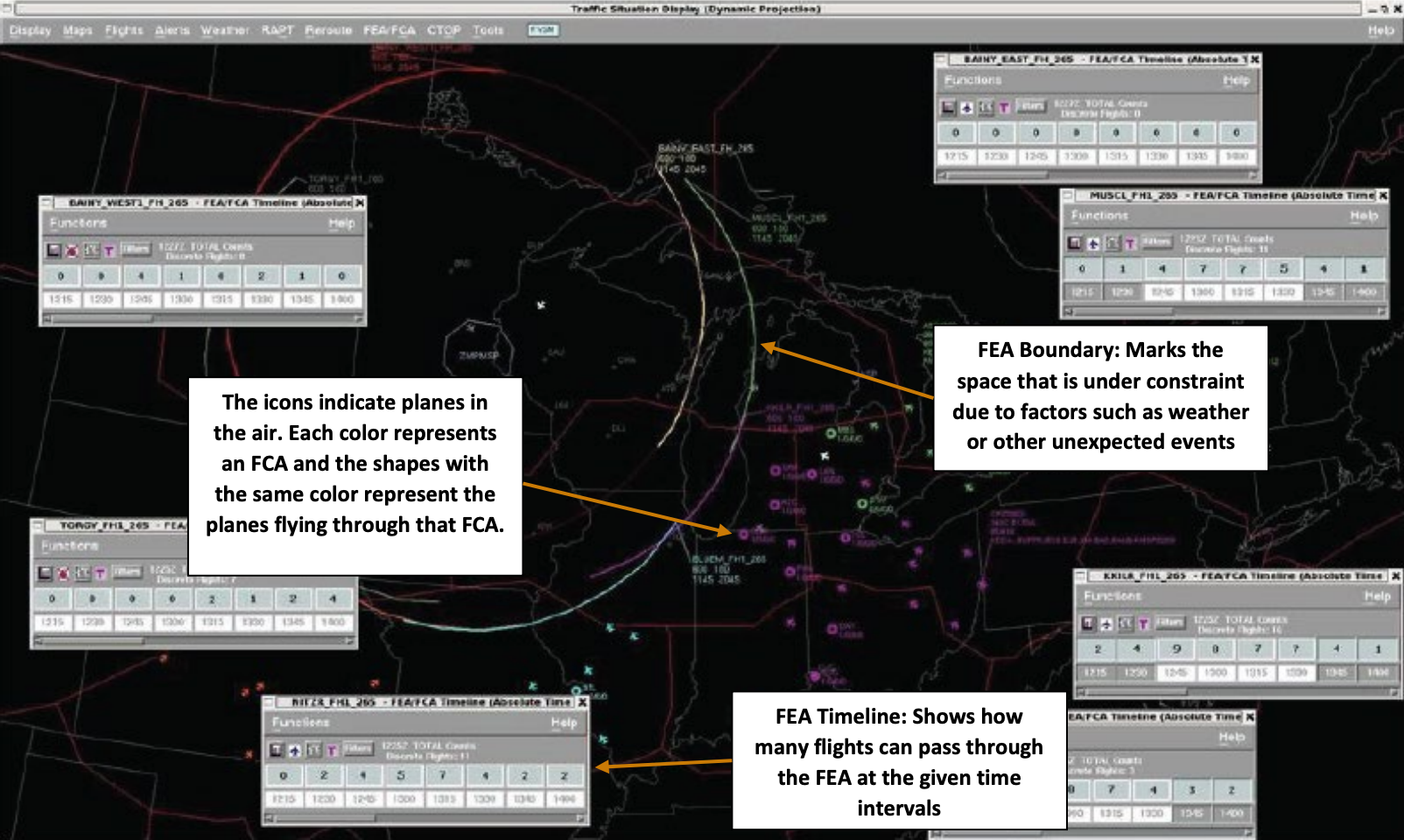
Map used to analyze airspace constraints: Lines and text are hard to read, and no help is provided for users (the white boxes with explanations are not part of the interface).
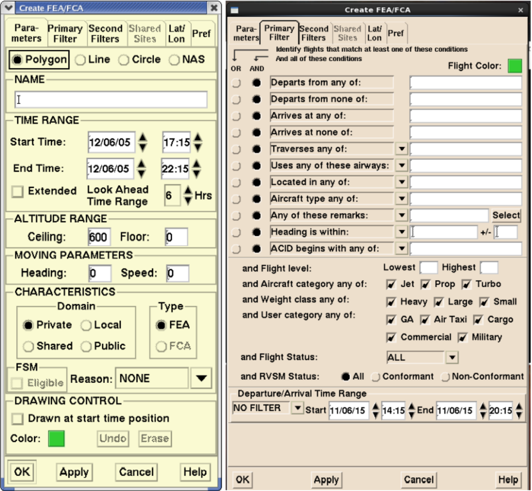
Dialogue menus used to create an AFP after using the map: The interface overwhelms the user with free-text boxes (error-prone) and lacks visual hierarchy.
Problem Statement
The current 20+ interface environment creates an inconsistent, tedious user experience for NTMS' AFP workflow that lacks cohesiveness among the application’s tools, compounded by extensive user training requirements that lack modern user experience design heuristics
NTMS: National Traffic Management Specialist (end user)
Understanding the User
To design a user-centered interface, we needed to understand the Traffic Managers we're designing for and their pain points. I organized and led 15+ hours of user interviews with:
• Current and former FAA Traffic Managers
• Delta Air Lines' Air Traffic Management team
• NASA Human Factors Engineers and Analytics Leads (which included former FAA Traffic Managers)
We strategically interviewed Traffic Managers from New York and Florida, as they're exposed to the nation's busiest airspace and have significant experience working with AFPs, which was the main focus of the Design Challenge.
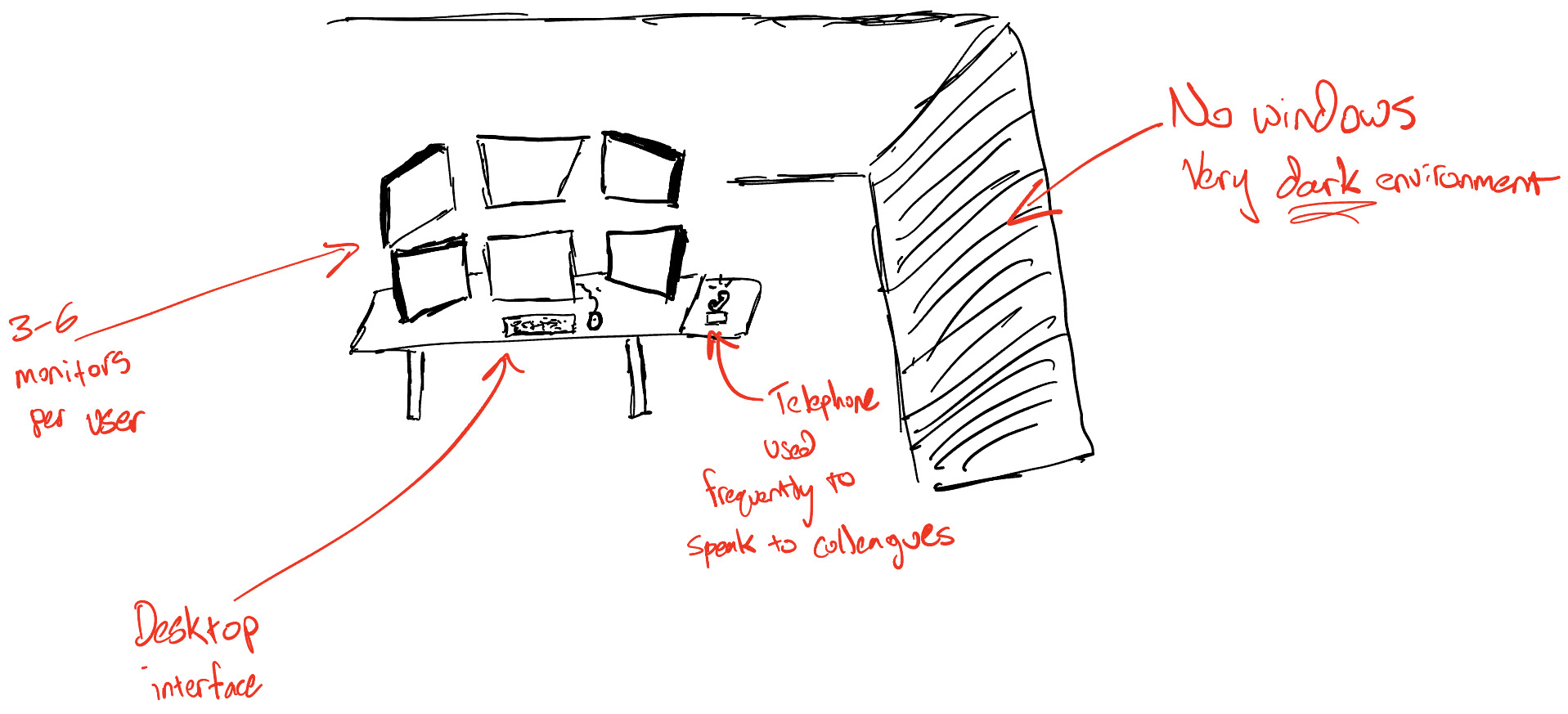
Work Environment
To understand the environment where Traffic Managers use the interface, I sketched out their workspace based off of photos of the FAA's Command Center and my experience in Delta's Operations and Customer Center (OCC).
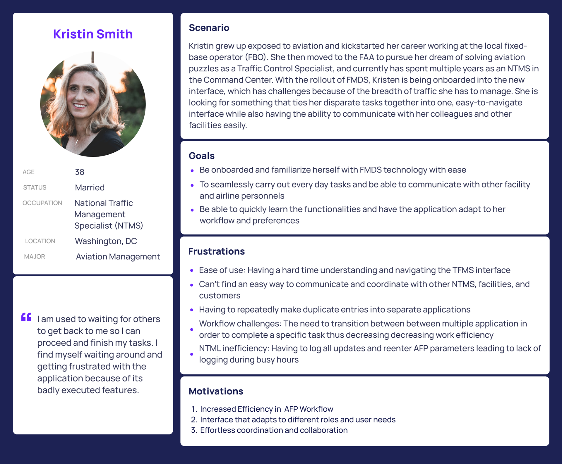
User Persona
We created a persona profile for our end-user, a National Traffic Management Specialist (NTMS). It highlights their goals and frustrations, and helped us keep user needs at the center of every design decision.
Key Takeaways from User Research
Iterative Design Process
With usability driving every design decision and a focus on addressing user pain points, I collaborated with 2 student designers to ideate, wireframe, and mockup a unified interface to drastically improve the user experience. Here is the evolution of our design process.
3 Core Functionalities
Evaluating
Evaluating gives users all the tools to easily identify constraints to aircraft: Weather, rocket launches, military airspace, and more. We designed a layer menu which allows users to stack different constraints on the map. This allows the user to declutter their workspace and focus in on the constraints that matter most to them. For each iteration, we focused on:
• Enabling easy playback to see how constraints such as weather are evolving over time
• Increasing contrast of different objects displayed on the map
• Summarizing potential problems in a concise list called the "Constraint Summary"
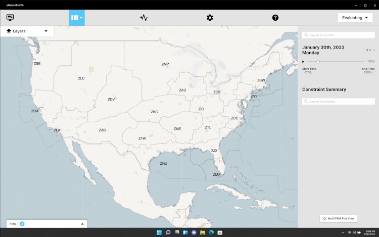
gif made by Kate Shen
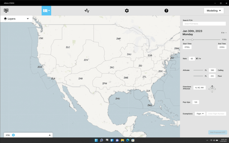
Modeling
Once the demand-capacity imbalance has been identified in a region of airspace, Modeling empowers users to build the right solution. In contrast to the clutter of the legacy interface, we designed a menu that conforms to how Traffic Managers model Airspace Flow Programs (AFPs). With this in mind, we designed an interface to enter parameters and instantly see its hypothetical impact on the National Airspace System (NAS), including delay metrics and demand-by-hour, via our Data Card. For each iteration, we focused on:
• Designing an input menu that mimics the way Traffic Managers model AFPs and discuss their strategy
• Facilitating easy comparison of different AFP proposals
• Making shareability of AFP proposals and their impact metrics effortless
gif made by Kate Shen
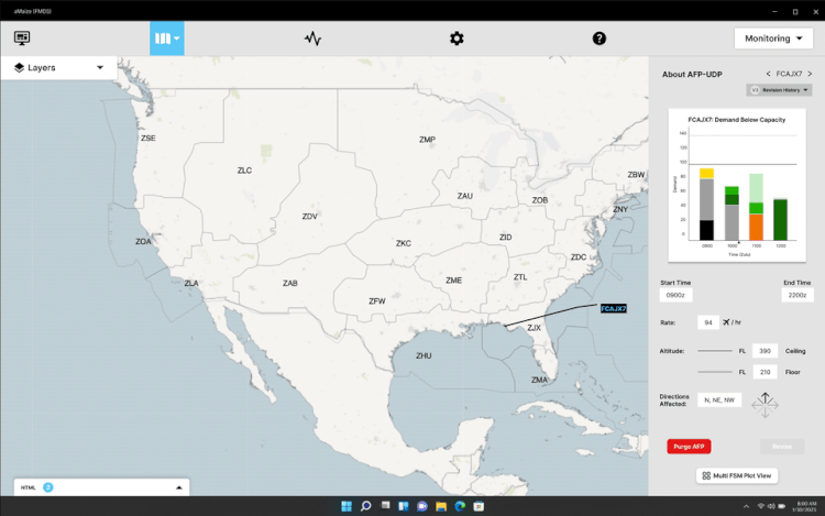
Monitoring
After the ideal AFP model has been created and implemented, Monitoring facilitates the empowers users to build the right solution. We designed a layer menu which allows users to stack different constraints on the map. This allows the user to declutter their workspace and focus in on the constraints that matter most to them. For each iteration, we focused on:
• Enabling easy playback to see how constraints such as weather are evolving over time
• Increasing contrast of different objects displayed on the map
• Summarizing potential problems in a concise list called the "Constraint Summary"
gif made by Kate Shen
Data Card: Creating better Data Visualizations
I led the design of an all-new "Data Card", which drastically enhanced how flight and delay metrics were communicated to the end user. Drawing on my background in analytics and data visualization, I used color, typefaces, and whitespace deliberately to make more critical information pop. The result was a data visualization tool that was highly praised by FAA judges.
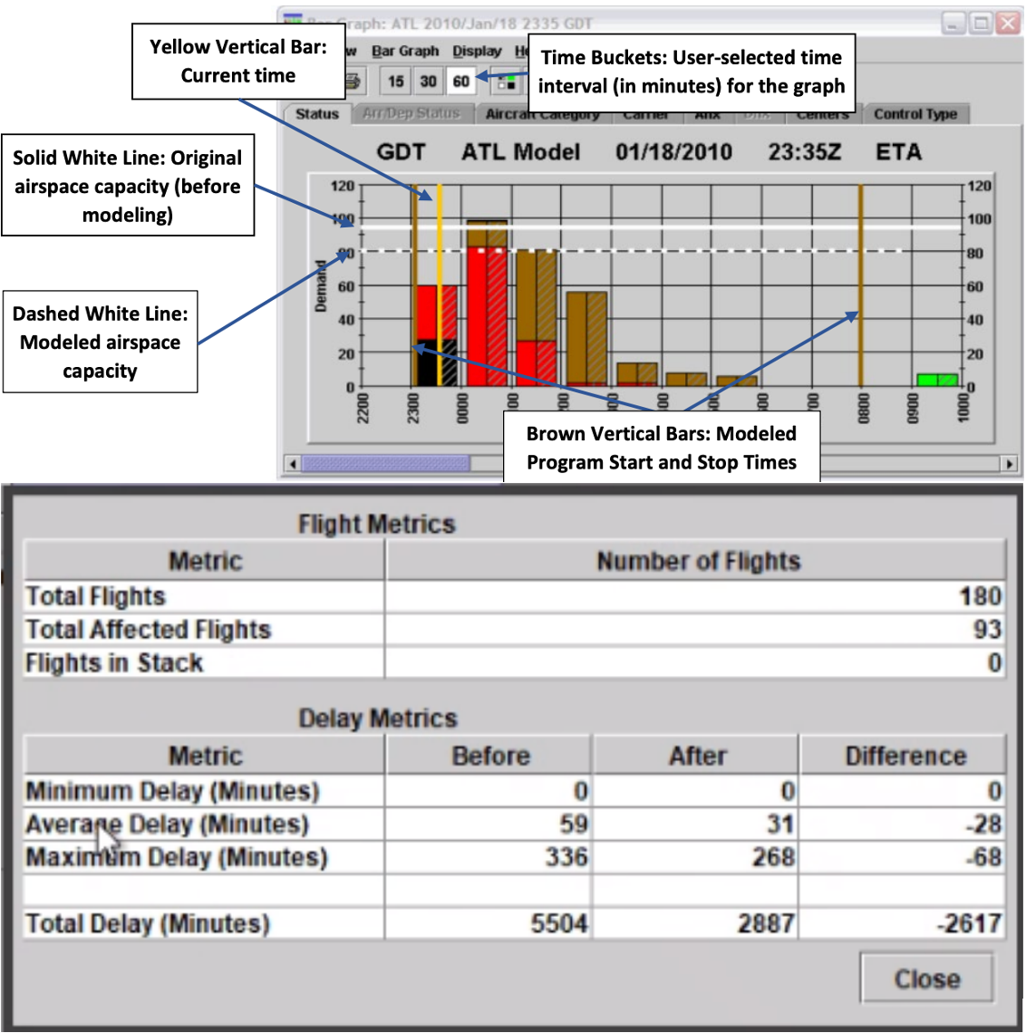
Current Design: Cluttered, hard-to-read, unclear color definitions
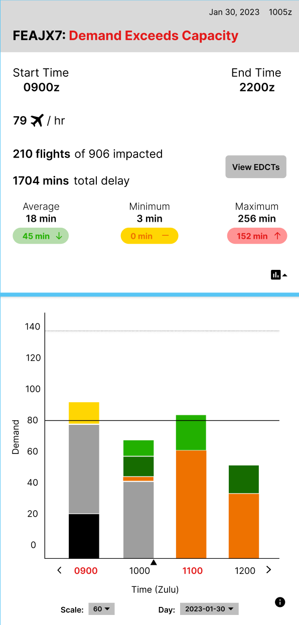
Our Design: Removed gridlines from bar chart, included legend, used colors and typefaces to make critical information more salient, added more visual breathing room