Trip.it
Digital Product Concept
Skills: UI/UX Design and Research
Software: Balsamiq, Figma, InVision


Overview
In my Digital Product Design course, I was given 8 weeks to find a problem and design a solution for users. I decided to pursue a problem related to the travel experience, and below is my process and results.
Trip.it is an itinerary planning website targeted mainly at tech-literate travelers 18-35 years old looking to create an itinerary for their next vacation. These travelers are overwhelmed with disorganized itinerary and travel recommendations online, making it frustrating, intimidating, and time consuming to create an itinerary. Trip.it consolidates crowdsourced itinerary information and travel advice in one place to make trip planning quick and easy. It also allows users to find, modify, create, and download itineraries that fit users’ interests, time available, and season they are traveling in to make the trip personalized and enjoyable. Trip.it's crowdsourced database is powered by experienced travelers and locals creating itinerary templates and adding activities, giving users unique, experience-based travel recommendations.
Exploring the Problem
As the travel agent for my family, I took it upon myself to plan trips around the world. For every trip I planned, I ran into the same issue: information overload. Tripadvisor and other "trip planning" sites were merely search engines for mainstream activities.
To get itinerary recommendations tailored to my trip length, season of travel, and interests, I had to do a lot of research, put together an initial plan, and ask for feedback on the r/travel Subreddit. It was a very time consuming and intimidating process. After browsing through the r/travel Subreddit, I discovered there were thousands of others with the same issue, looking for travel advice tailored to their needs.
Problem Statement
Travelers (18-35 years old) need an easy and efficient way to obtain an itinerary in order to maximize enjoyment and time for the best possible travel experience.
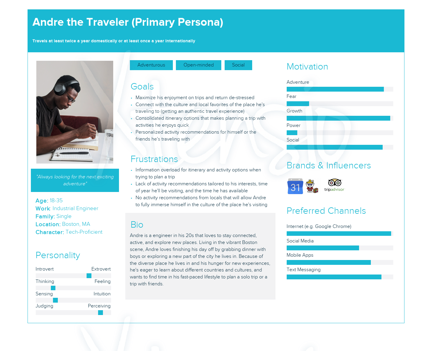
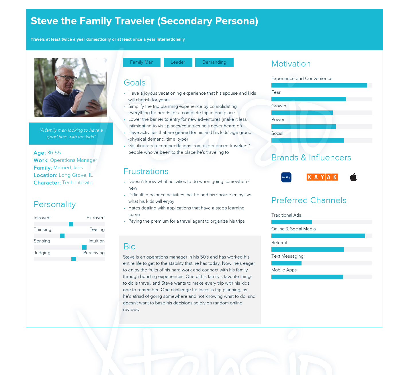
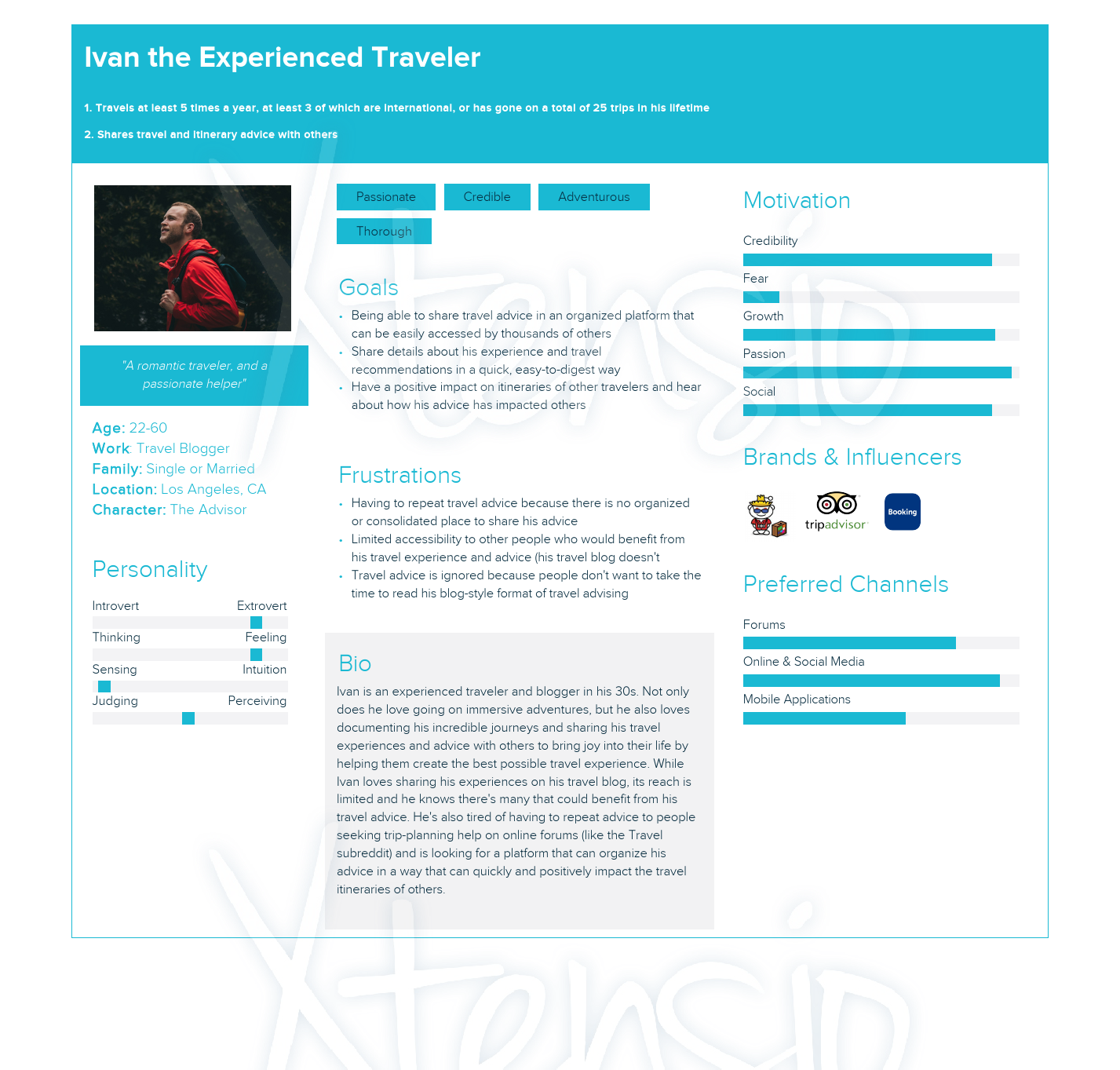
Understanding Users
Early in the project, I created 3 personal profiles to understand the primary users of Trip.it, as well as 2 secondary users. This is essential in recognizing who I was designing for, and tailoring the product to meet the needs of my users.
Early Wireframes in Balsamiq
Key Design Elements:
- Itinerary templates are easily visible and selectable on homepage: less intimidating to begin trip-planning process
- Itineraries are easily customizable: user can swap out activities tailored to their interests, season, and time available
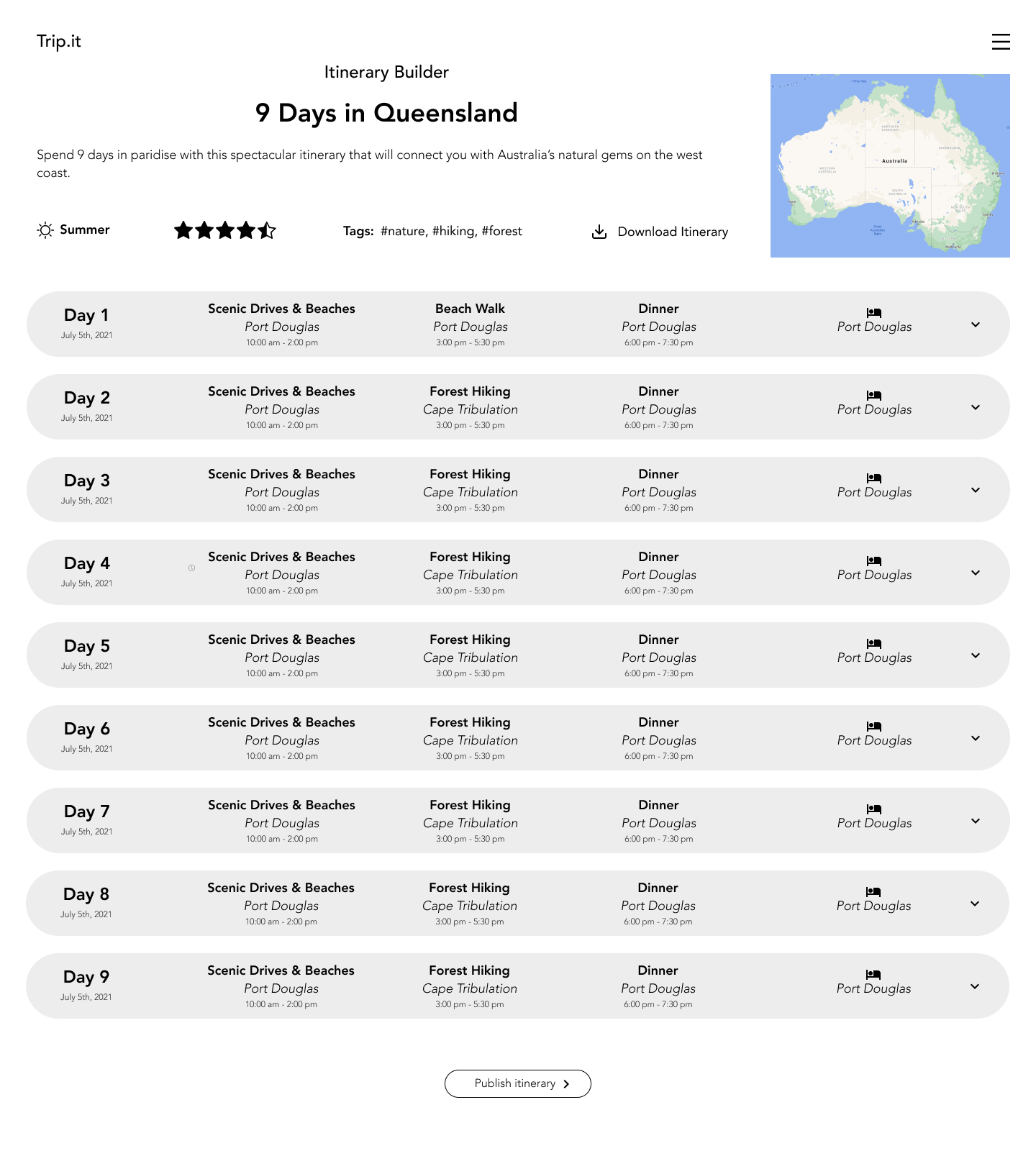
Home Screen - Browse and search itineraries
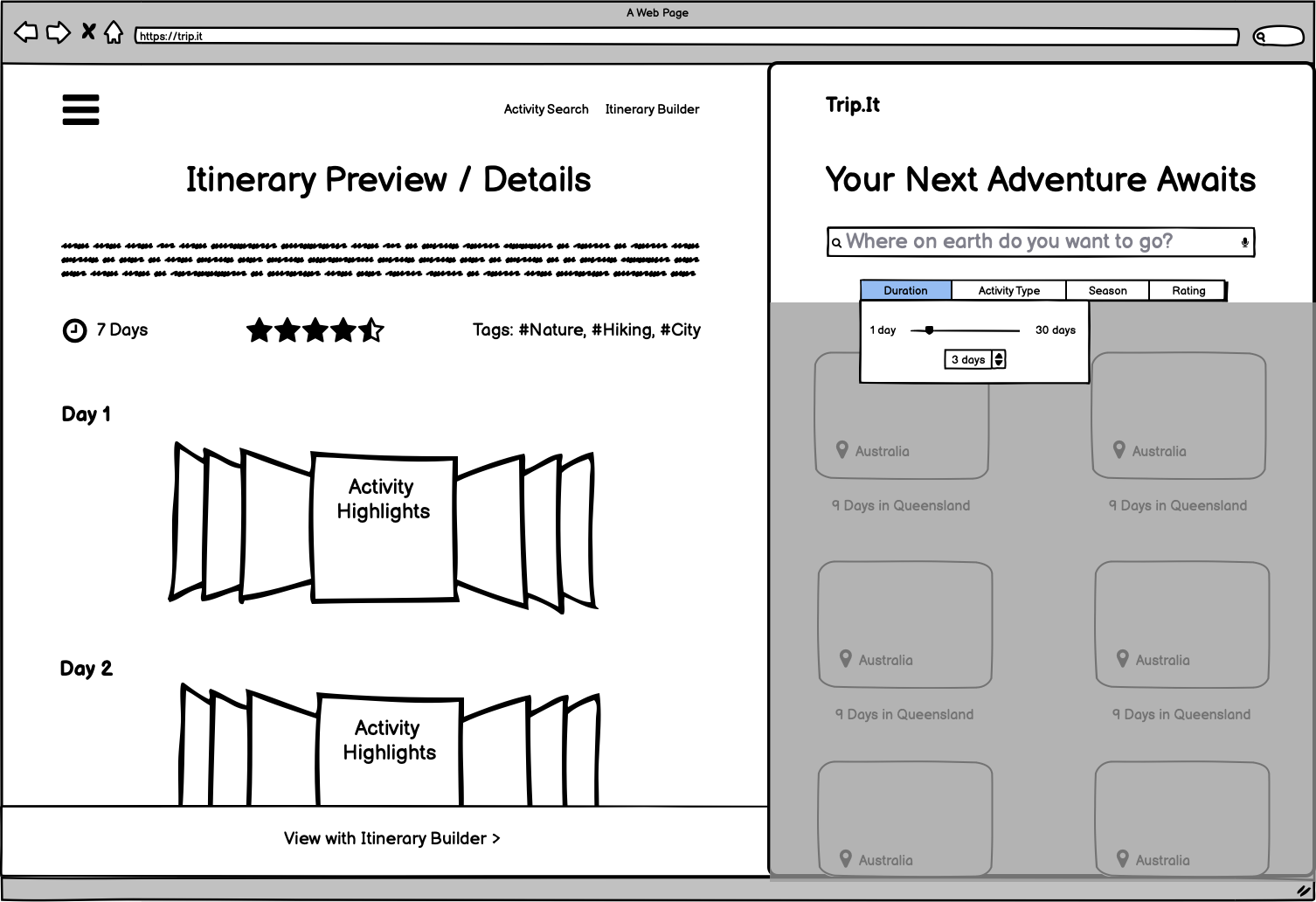
Home Screen - Adjust trip duration
Itinerary Details
Feedback:
- Homepage with itinerary templates is intuitive and clean; ratings and filters are especially useful
- Itinerary details page layout shows progression of day nicely, but has potential to get cluttered
- Not clear how the activities will be categorized and presented on the itinerary details page
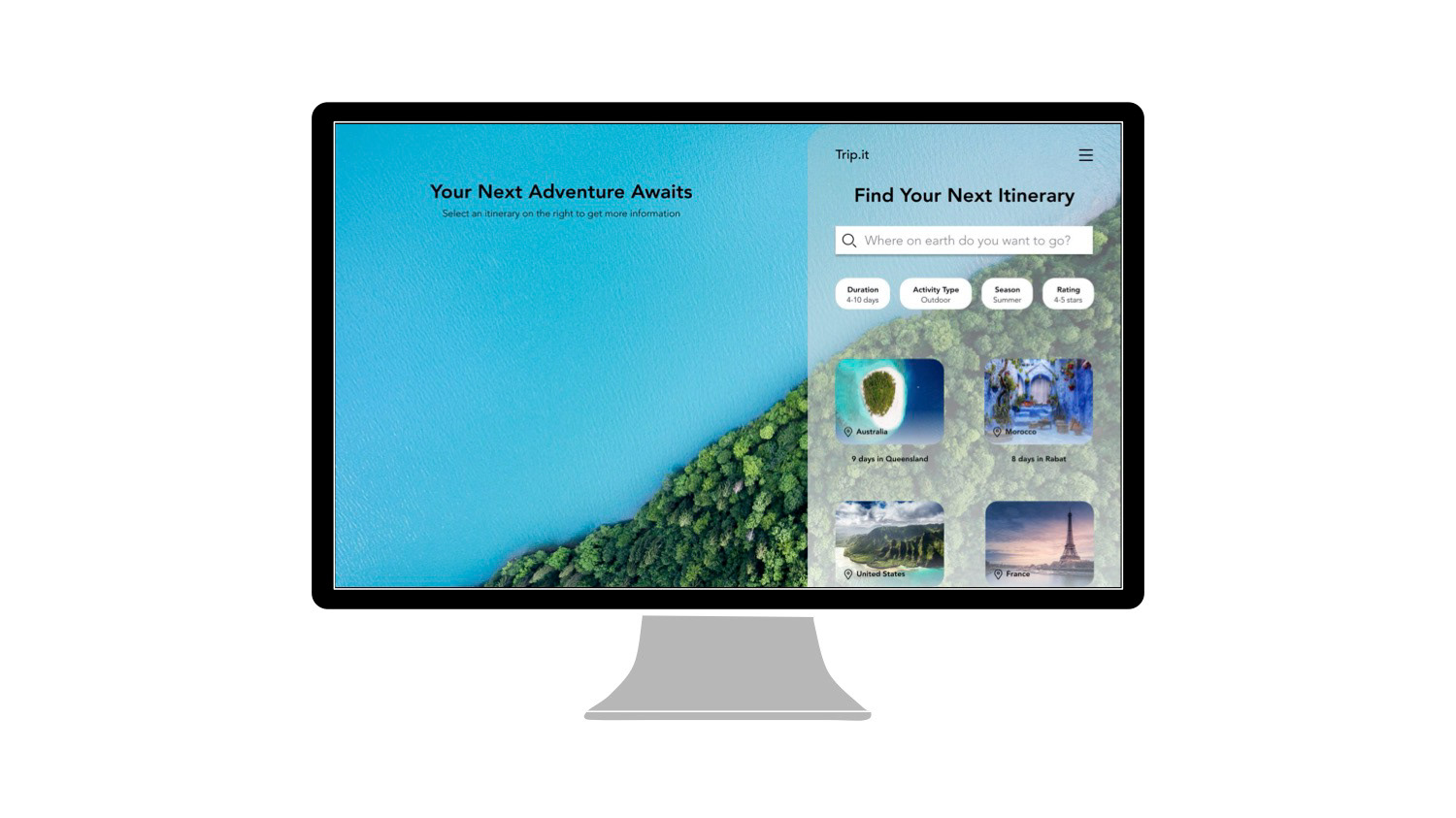
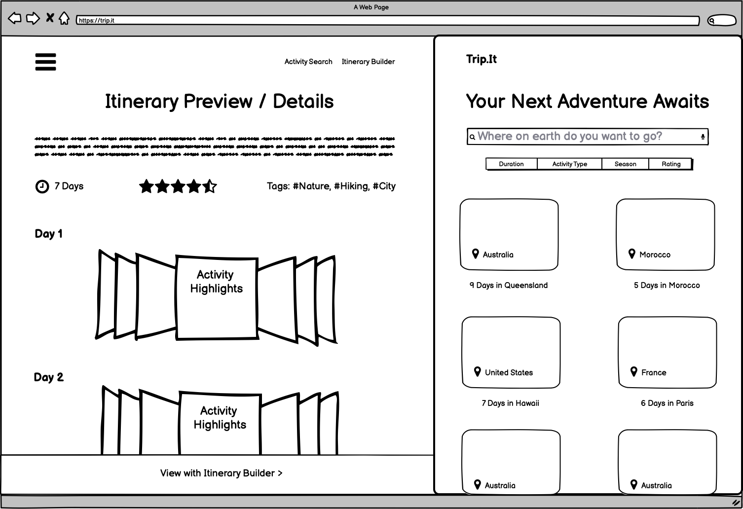
Hi-Fidelity Wireframes in Figma
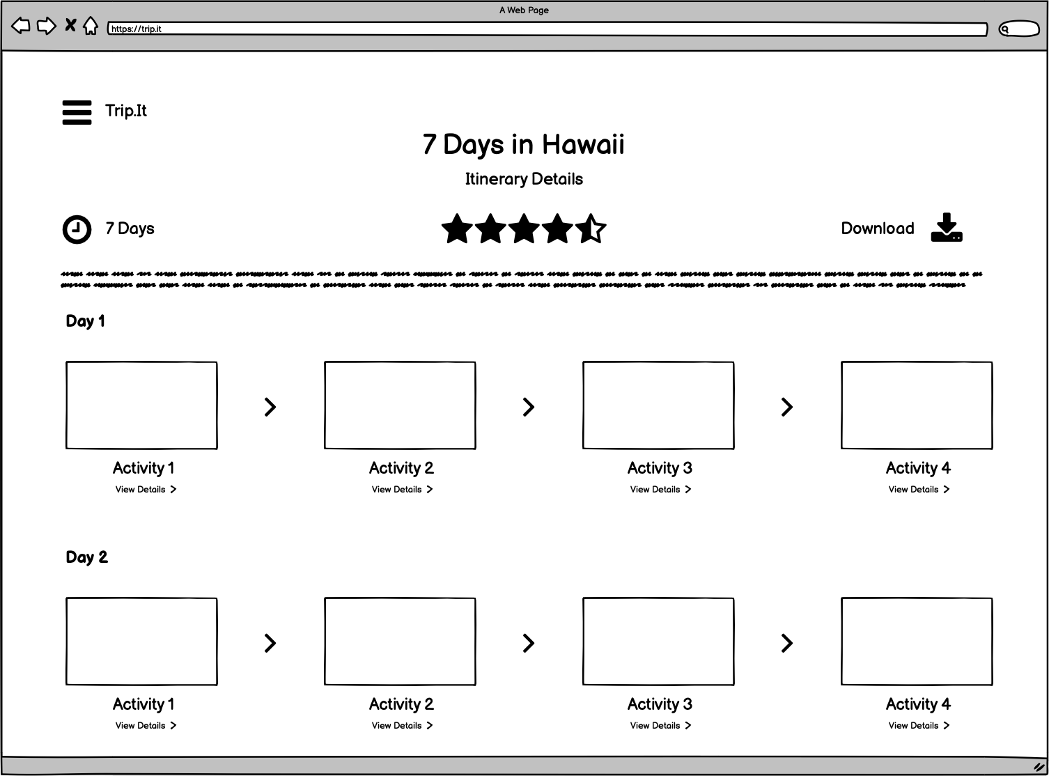
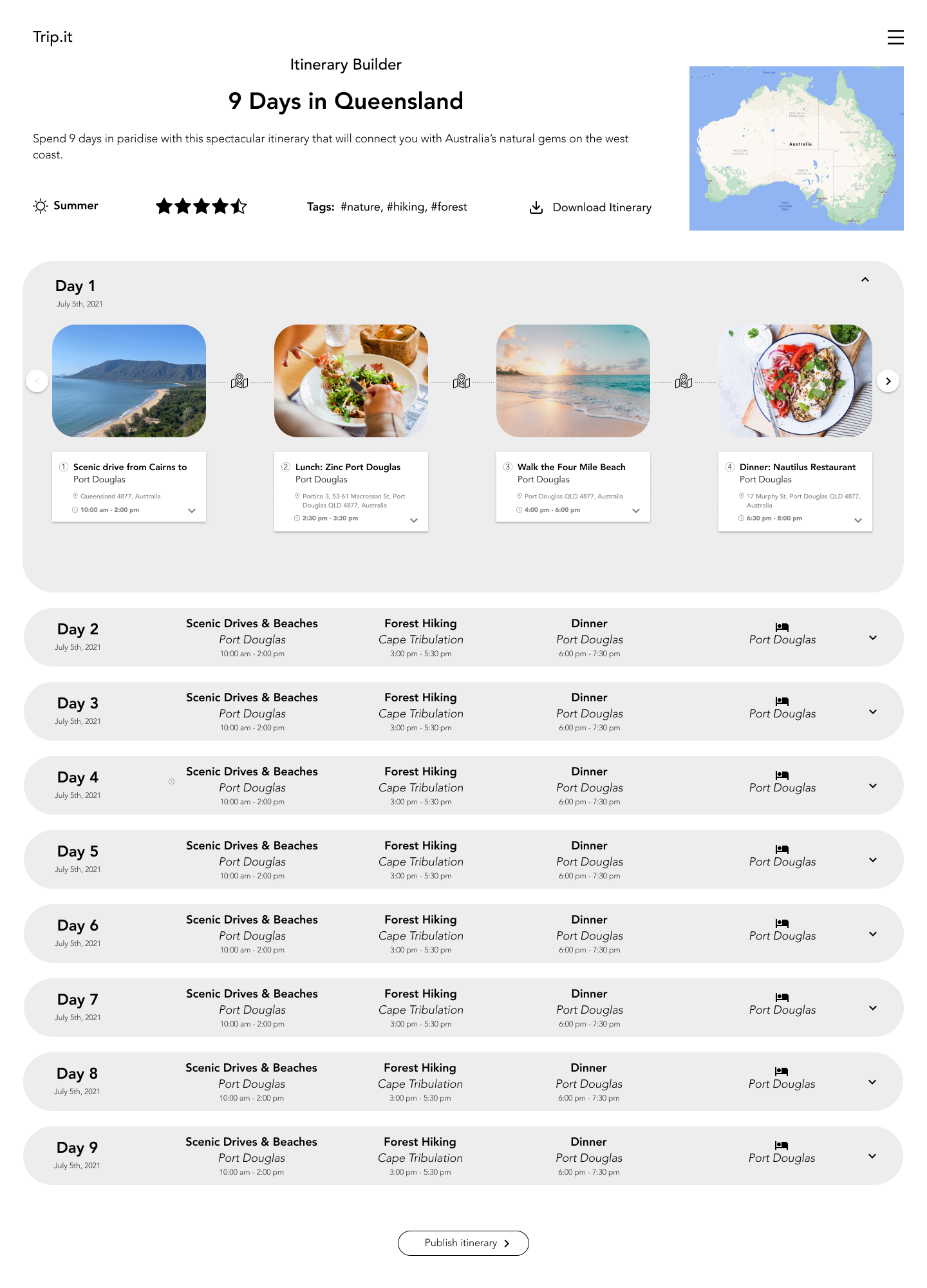
Using feedback from my Lo-fi prototypes in Balsamiq, I maintained the same home screen layout, and made adjustments to the itinerary details page. I designed a collapsed view of an itinerary details page to prevent clutter. When a day is expanded, details about the activities for that day are given in sequential order.
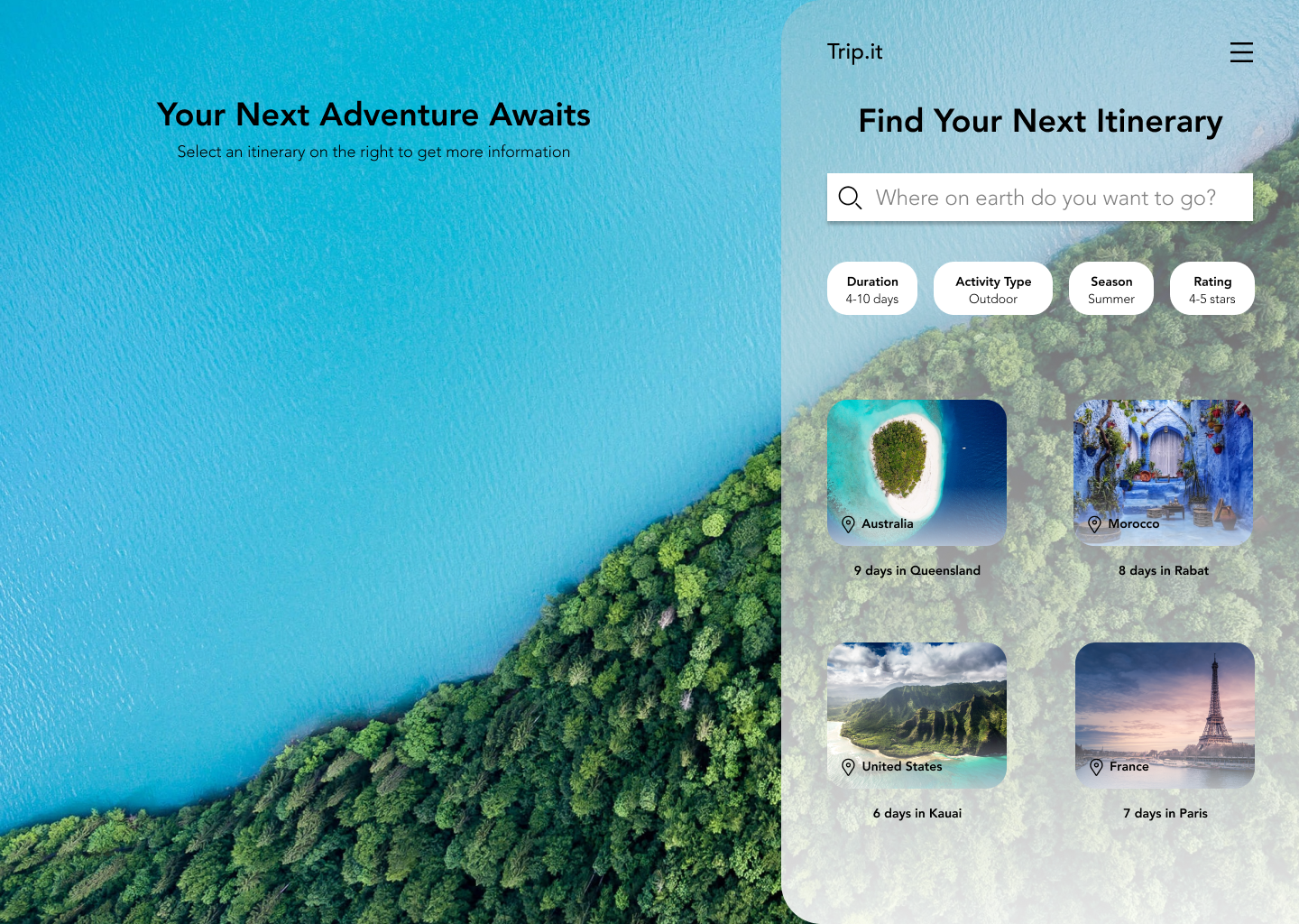
For the Trip.it homepage, I was inspired by travel-related application designs on Dribbble. I liked the concept of having a list of itineraries to choose from on the right, and a detailed view of that itinerary (when selected) on the left. For displaying activities in the detailed itinerary view, I was inspired by how Booking.com allows users to navigate between different hotels using left and right navigation buttons; it's a clean way to display a lot of information.
Browsing and selecting an itinerary
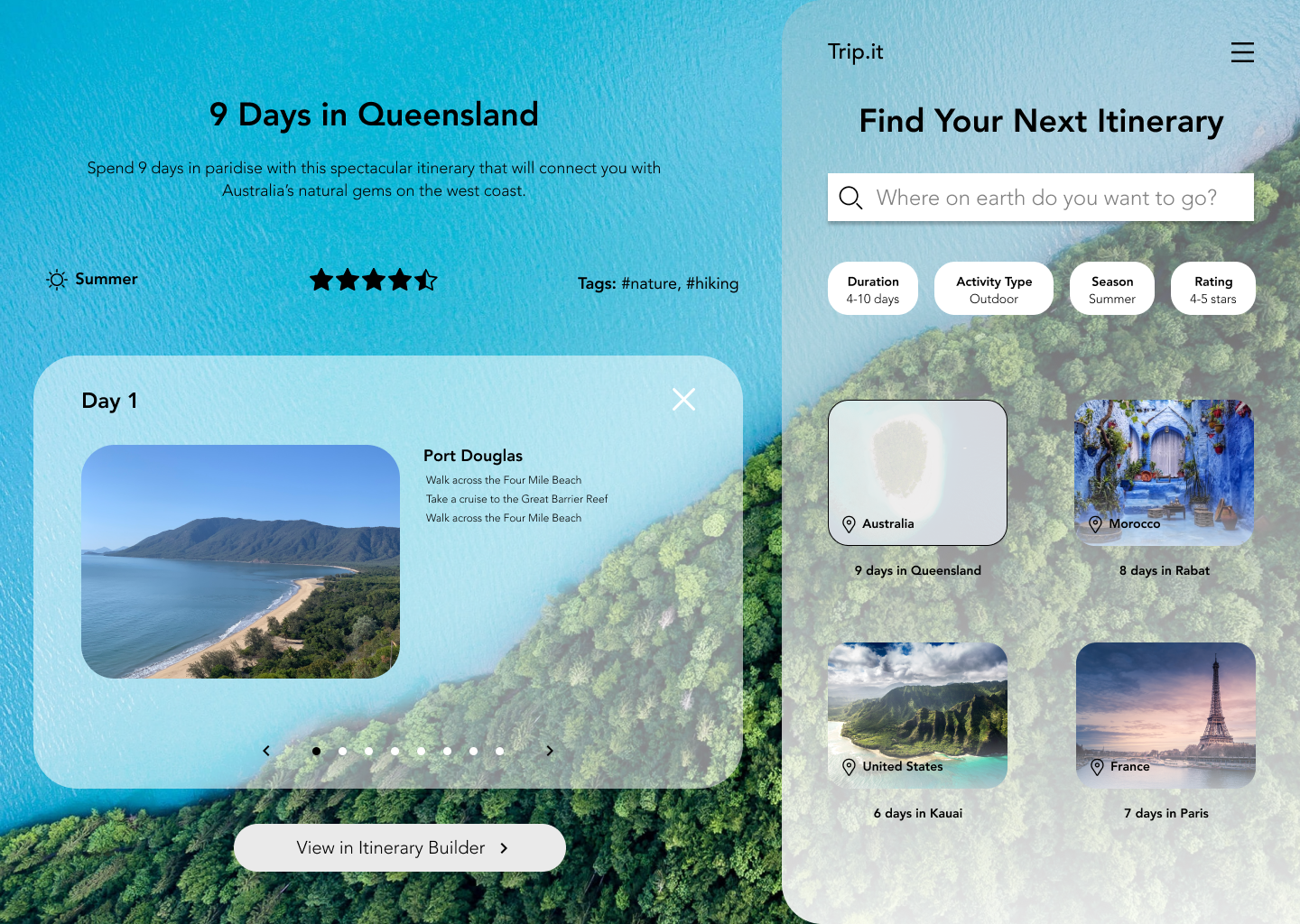
Viewing an itinerary's details
Feedback
- The overall design is very clean and intuitive, and the concept is very effective in preventing information overload
- Think more about navigation in the platform; make it easy for the user to move around your digital product
- Having an onboarding process would be nice in introducing the user to the interface and in managing expectations
- Having user accounts so users can save their itineraries and re-access them
Using feedback I received on my hi-fidelity wireframes, I added x's, forward and back arrows, and a working hamburger menu to make navigation easier, and prototyped my screens in InVision.
Future Plans
Trip.it is a Simple, Lovable, Complete (SLC) product, and accomplishes its goal of making the travel planning experience rapid, easy, and customizable while preventing information overload. In the future, features like user accounts could be implemented to access saved itineraries, however, this is not necessary as Trip.it is designed to be a rapid itinerary planner. Onboarding would be a good addition to manage expectations for this SLC product, and convey that it is a rapid itinerary planner.